Shopping cart
$0.00
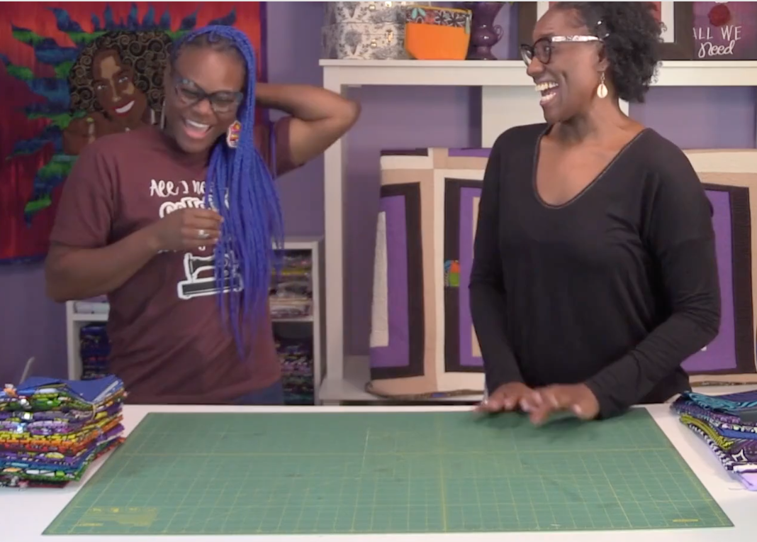
Welcome to Quilting Color Theory with Chrissy and Kena. In this exciting blog, we invite you to join us on a creative journey where we explore the captivating world of color play in quilting. Get ready to discover new ways to experiment with vibrant colors and bold prints that will bring a fresh and dynamic energy to your quilting projects. Quilt artist Kena Dorsey and Grace Ambassador Chrissy Shoaf will be your guides, sharing their expertise and insights on color theory, fabric selection, and techniques that will empower you to infuse your quilts with eye-catching visual impact.
Monochromatic color play in quilting involves working with a single color and its various shades, tints, and tones. By using different values of a single hue, you can create a visually cohesive and harmonious quilt design. One way to incorporate monochromatic color play is by selecting fabrics that range from light to dark within the same color family. This technique allows for subtle variations in color intensity while maintaining a unified look. Whether it's a soothing blue quilt or a striking red masterpiece, monochromatic color play in quilting offers a versatile and elegant approach to creating quilts with a strong visual impact.
Watch the full color play segment
Analogous color play in quilting involves working with colors that are adjacent to each other on the color wheel. This color scheme creates a sense of harmony and cohesion in your quilt design. To use analogous colors effectively, select two or three colors that are next to each other on the color wheel and incorporate them into your quilt's palette. For example, you could choose a range of blues and greens or yellows and oranges. By blending these analogous colors in your quilt blocks, borders, or fabric choices, you can create a visually pleasing and balanced composition that evokes a sense of unity and tranquility in your quilting projects.
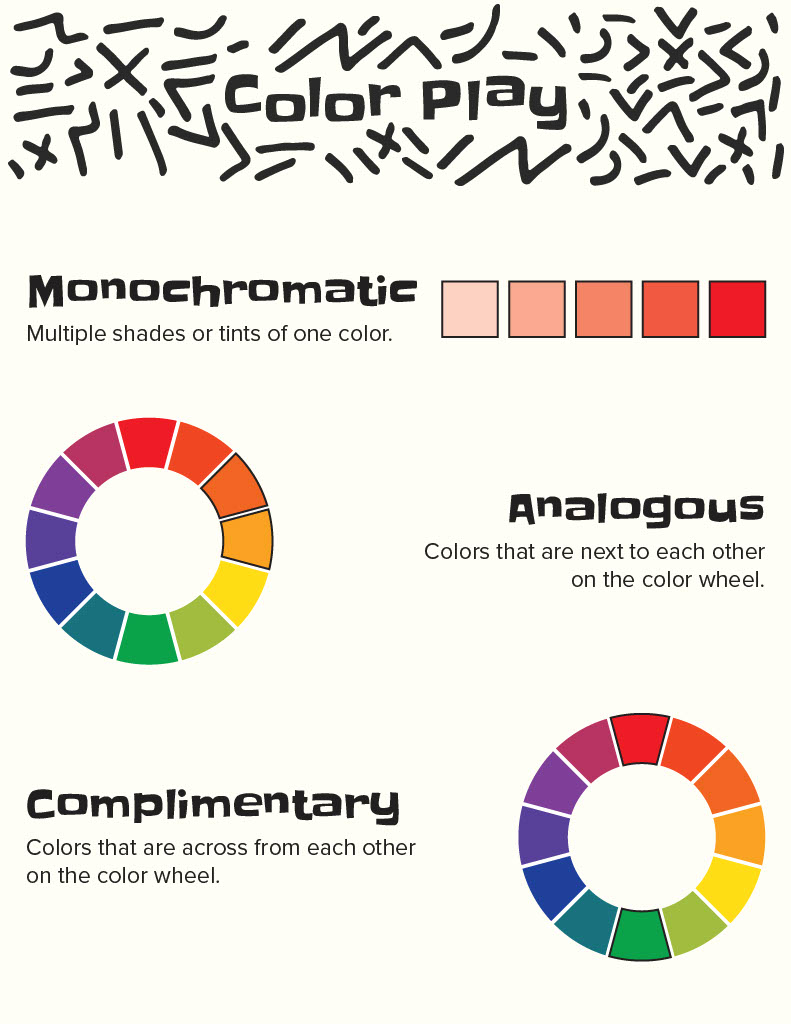
Complementary color play in quilting involves working with colors that are opposite each other on the color wheel. This color scheme creates a dynamic and striking contrast in your quilt design. To use complementary colors effectively, choose pairs of colors such as red and green, blue and orange, or yellow and purple. By incorporating these contrasting colors into your quilt, you can create a vibrant and energetic visual impact. Complementary colors can be used in various ways, from contrasting blocks and borders to using them as accent colors in your fabric choices. This color scheme adds a sense of excitement and boldness to your quilting projects, making them visually captivating and engaging.
Watch the full color play segment
As we conclude our exploration of quilting color theory with Chrissy and Kena, we hope you feel inspired and empowered to embark on your own creative adventures. Remember, color is a powerful tool in quilting, and understanding its principles and techniques can elevate your projects to new levels of artistic expression. Embrace the bold, the vibrant, and the beautiful, and let your quilts become masterpieces of color and design. Thank you for joining us on this journey, and may your quilting endeavors continue to be filled with joy, creativity, and the magic of color!
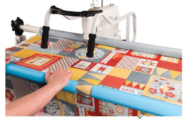
For over 25 years the Grace Company has been the leading manufacturer of high quality quilting frames and quilting accessories. What truly sets The Grace Company apart from other competitors is its level of quality, value, and experience toward all their endeavours. From products to external and internal customer experience, the Grace Company responds to market and customer needs and continues to lead the quilting industry. Grace Company frames and hoops are designed to be easy to build and compatible with most major quilting machines. They'll have the quilting product you need.